
William W. Lager
These projects range from small collaborative works to large team productions. My roles included product and project management, art direction and group facilitation combined with content creation, from illustrations, data analysis and visualizations. Each utilized my skills and experience to provide a synthesis of content, collaboration and delivery systems to connect with audiences.
For each of the projects they followed an ethical framework utilizing best practices for the handling of data, both internally and in journalism products. I also created style guides for visual presentation at MPR News.
I approach each project from the standpoint that data represents people, either their lives or what affects their lives, and data should be treated accordingly. Often data is used for reporting, it informs and shapes it, but isn't released in a raw format. The interpretation of that data is where the visuals come in. Sometimes for a simple chart a platform like Datawrapper or Flourish is used, for others an illustration or something handcrafted is more engaging and appropriate for audiences.
In the MPR News room I was the data resource, often assisting reporters with data collection, cleaning and other tasks. My data work ranged from the gargantuan datasets of climate change to small handcrafted databases of rural hospital closures to tracking '1033 Program' federal distributions of military hardware to police and many others between.
At MPR News, datavis was credited as the graphic paired with a story under a radio reporter byline. Due to this legacy media style choice many data works show credit on visualizations, but not bylines. Examples of this may be found here.
Amid these long term projects, I built frameworks for quick turn explainers, maps, and illustrations to take the complex and make it relevant, interesting and engaging no matter what platform the audience chooses. I also wrote many stories under my own byline. Each work built upon its predecessors and served to normalize the use of engaging storytelling as audiences were increasingly engaged on visual platforms.
A verbose list of my skills may be found here.
All of the project images on this page by William Lager.
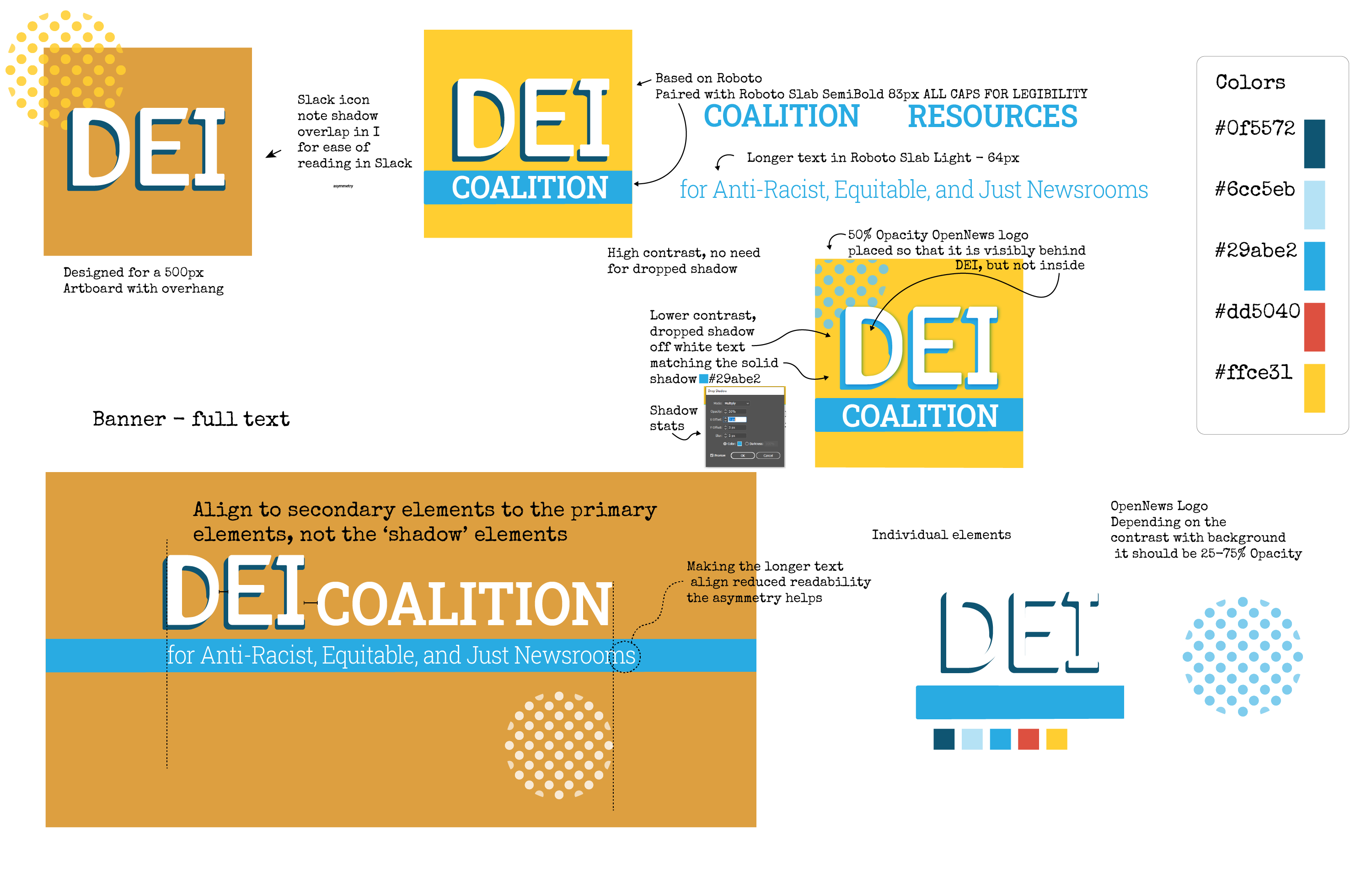
I worked with an amazing group of volunteers and the OpenNews staff to help create the DEI Coalition For Anti-Racist, Equitable, And Just Newsrooms. A space created by OpenNews and over 100 members of the journalism community have co-created a digital community space dedicated to sharing knowledge and taking concrete action in service of a more anti-racist, equitable and just journalism industry.
In addition to designing the branding and online identity, I worked on the Slack setup committee and helped create the systems supporting the membership application and member management systems.
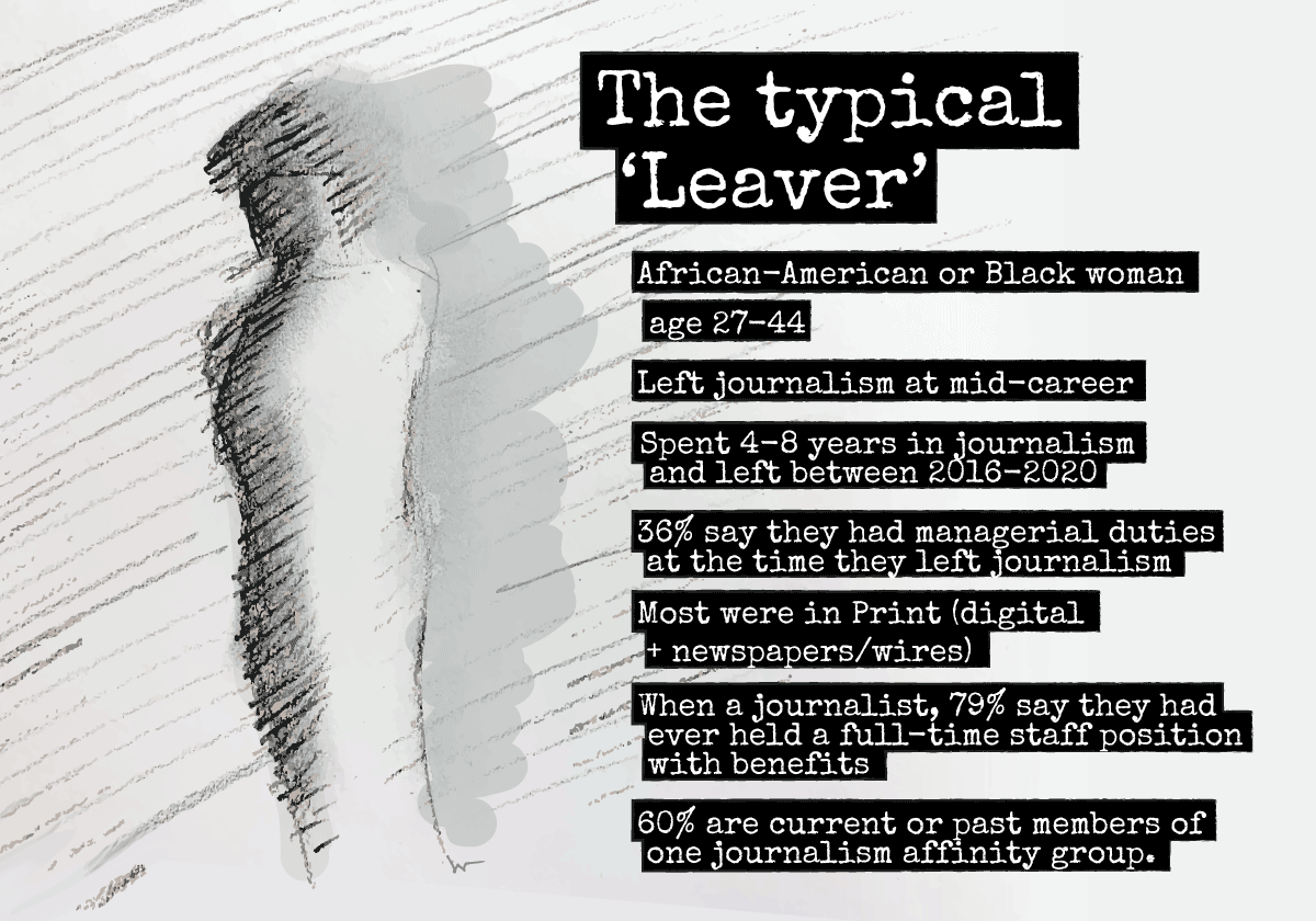
The results of the 'Leavers' survey of 101 former journalists of color conducted Feb-March 2020 by Carla Murphy to understand when and why they left the journalism industry, as race/ethnic representation and accurate coverage remain a challenge in U.S. newsrooms.
Working with the author and creator of the survey, Carla Murphy, I was the product developer and designer; coding, editing and crafting the interactive report structure and navigation for accessibility and utility. I performed the data analysis and data-vis creating the visual experience with an eye towards accessibility. I also managed user testing, editing and technology coordination with OpenNews.
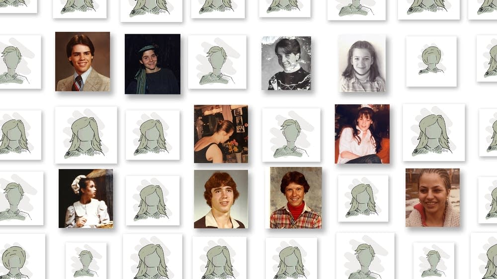
For Innocence Lost, an award-winning project on the child sexual abuse at the Children's Theatre Company, I managed the story production, art direction, and illustrations. I set up and administered document OCR and analysis in coordination with the team through the reporting process. Working with the reporter and editor team I ensured that the digital and audio experiences met the audiences where they were.
Due to the sensitive nature of the project, data and documents made available to audiences were handled in accordance with personally identifiable information ethical standards.
I crafted the illustrations in collaboration with the team, to empathetically amplify the stories of those affected by the abuse. We brainstormed as a team to find a way to make sure that we didn't place vulnerable people in harm's way while conveying the story, and the illustrations were that solution to portray those who were unwilling to be named or depicted in photographs without causing harm. The lead image of the lead story was updated multiple times after more survivors allowed the use of their images based on their reactions to the coverage.
The visuals were crafted with social media engagement in mind, various versions of visual elements were crafted to maintain a consistent multiplatform campaign. Examples may be seen on Twitter(here and here) and Instagram (here and here).
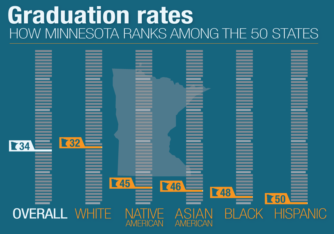
Minnesota's failure to graduate its high school students of color is among the worst in the nation. Students who are Native American, black, Hispanic or Asian-American in Minnesota are less likely to graduate on time than their counterparts in nearly every other state in the country. I collaborated with the team to craft a visual theme and format for data visualizations, analyzed the data and crafted the visuals. The data was gathered from state agencies and schools and was analyzed in various tools, cleaned and normalized. The graphics were paired with extensive reporting for context and common visual storytelling threads.
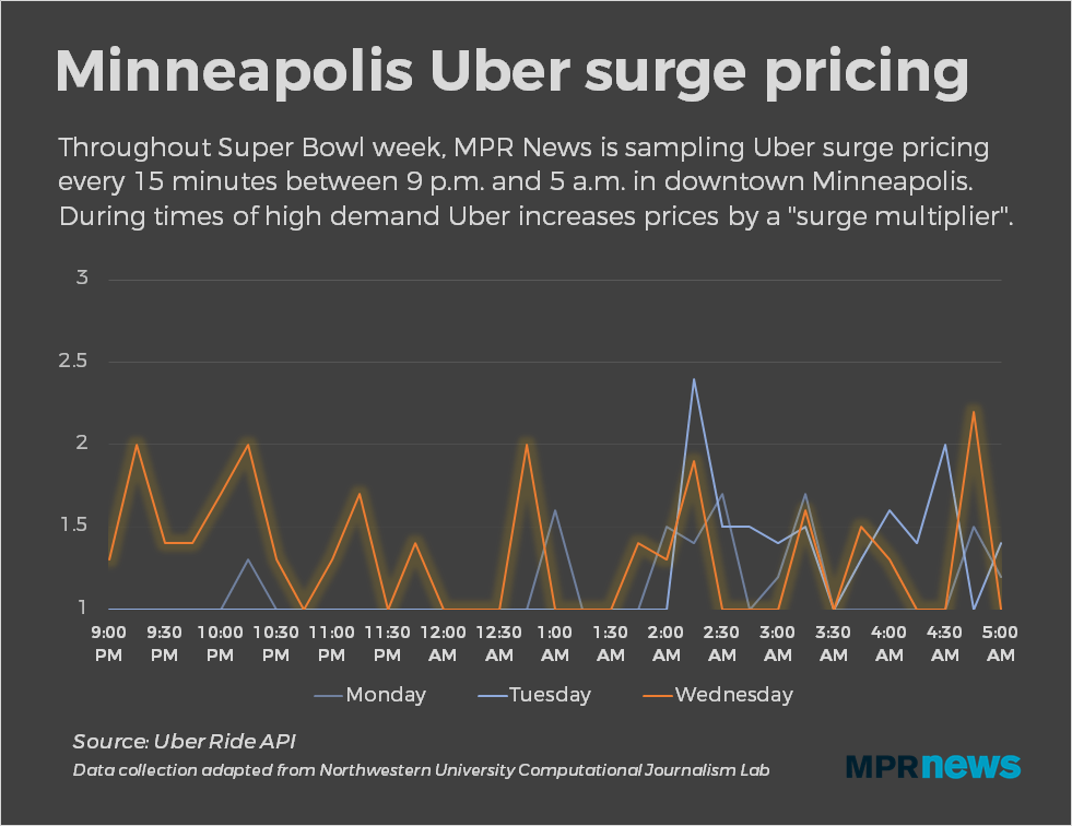
I worked with reporter Solvejg Wastvedt to quantify surge pricing by Uber during Super Bowl. The data was collected via a modified Python application from the Northwestern University Computational Journalism Lab. The idea was based on the assumption that drivers would be able to rake in the cash during the Super Bowl. The reality was quite different.
We polled Uber data via one of their api endpoints to create our own dataset. We used Knight Labs Storymap for guiding audiences through notable points of reporting.
A project developed with reporter Solvejg Wastvedt, in concert with the political team, to track the independent expenditures in Minnesota's 2018 congressional races. Independent expeditures allow groups to spend without contribution limits on advertising and other efforts for and against candidates. Utilizing a Python application that polled campaign finance data, normalized it and then updated the microsite for editoral review before updates were published.

The Dupont award-winning project on the clergy abuse, cover-up and crisis in the Twin Cities Catholic church. Coordinating with the team I built the story templates and front-end web work, and the infrastructure of the project in addition to ongoing support as new stories came to light. I also performed data analysis and visualization.
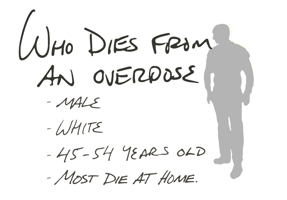
• Here's why Minnesota has a big problem with opioid overdoses
Stories of addiction, loss and recovery amid a public health crisis that has hit epidemic proportions. I worked with the team to analyze data on overdose rates, prescription amounts and various other datasets. I then designed the visuals and an animated guide to overdoses and how naloxone may halt an overdose.
A century of data proves it: Climate changes have arrived in Minnesota. It's warmer on average, especially in winter, and heavier rain falls in bigger storms.
The amount of climate data to collect and analyse was immense. I worked with the team to collect and analyze data from the National Climate Assessment, the Minnesota Department of Natural Resources, Minnesota Department of Health and others sources. I analysed the data and created base visuals then worked with a freelance designer who produced the final graphics. An exhaustive list of the data sources may be found here.
A testbed for reporting presentation and audience engagement. Focused as experimentation for mobile friendly and lightweight browser based presentations and interactives to entice audiences to engagement. Working with editor Dave Peters and various reporters, we were able to experiment with varied technologies and techniques to bridge the gap with audiences. I coordinated with various freelance photographers as I coded the web presentations, performed data analysis and created the data visualizations.
Ground Level - Fighting for an American Countryside
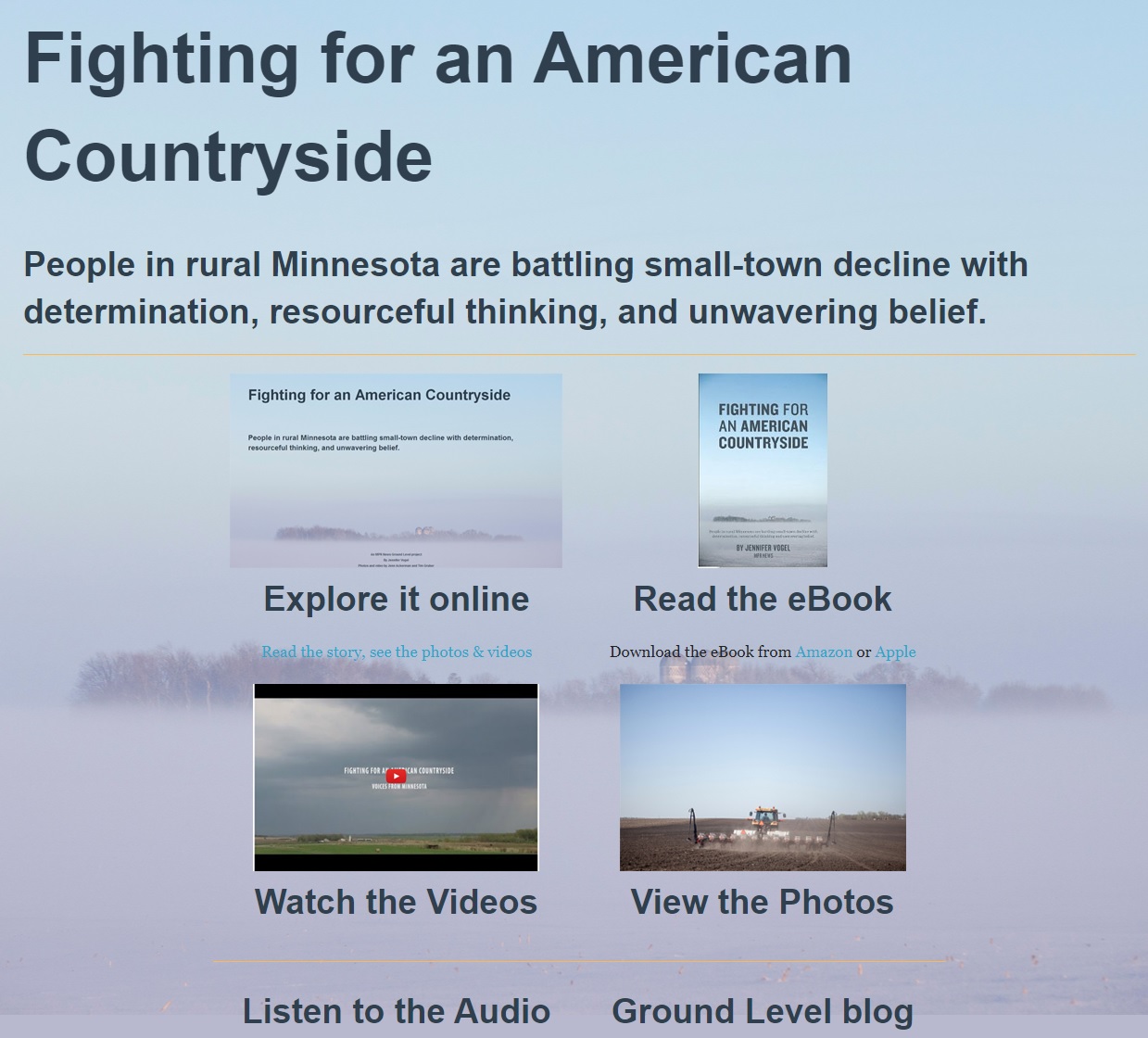
People in rural Minnesota are battling small-town decline with determination, resourceful thinking, and unwavering belief.
A multi-avenue presentation from the Ground Level project that meets the audience where they are. For Fighting for an American Countryside, on how rural communities faced a changing world, I was the producer, product manager, data journalist and web developer, among other roles. I coded the multi-platform presentation with an eye for the future. This work was a foundation for the Betrayed by Silence project infrastructure.
Ground Level - Beneath the Surface
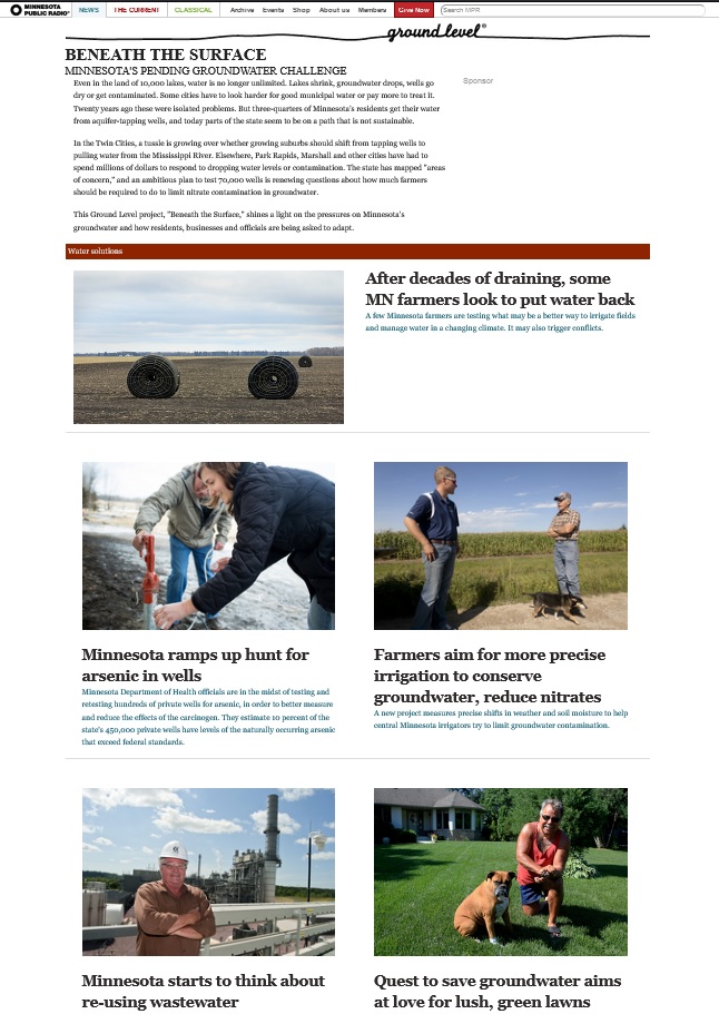
This Ground Level project, "Beneath the Surface," shines a light on the pressures on Minnesota’s groundwater and how residents, businesses and officials are being asked to adapt. I coded the presentation, produced the stories, coordinated with the freelance photographers, and provided data analysis and visuals.
• Unchecked irrigation threatens to sap Minnesota groundwater
A look at irrigation wells with and without permits based on Minnesota Department of Health well and boring records combined with Minnesota Department of Natural Resources water permits. The interactive map was presented via Google Fusion tables.• Minnesota ramps up hunt for arsenic in wells
An analysis of MN Department of Health data for arsenic contamination.• Irrigation boosts potatoes, but Park Rapids pays more for water
An analysis of aquifer quality data, GIS and survey data.
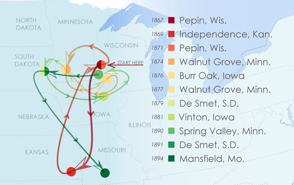
• Where the Wilder things are: The Laura Ingalls Wilder road trip
The travels of Laura Ingalls Wilder and her family - in one flat image. Sometimes the point is to show the chaos of a story.